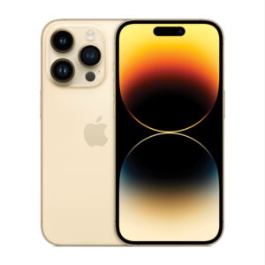
Pro Max price, Pro Max features, Pro Max teething pains.
Apple iPhone 14 Pro Max review: Big swings and growing pains
At a starting price of $1,899, you'd expect the iPhone 14 Pro Max to offer the best of the best. It's one of the most expensive phones you can buy - especially in terms of devices that don't fold - so it's natural to want everything AND the kitchen sink.
And look, Apple has done a better job of justifying the premium price of the iPhone 14 Pro Max than many other high-end phones on the market. The camera is fantastic and it has the best battery life of any phone we've tested this year, and especially the latter goes a long way.
At the same time, the iPhone 14 Pro Max suffers from being Apple's first device to introduce a whole host of new features. The always-on display. The dynamic island. The 48MP primary camera. They're enough to draw a line in the sand between the iPhone 14 Pro Max and last year's models. It's not quite the radical departure iPhone X introduced, but it's a soft reset - enough to make iPhone 14 Pro Max feel like a first-generation product.
This means growing pains. All of these new features, are for the most part, good. They're all very welcome and in some cases, genuinely change how you interact with your iPhone. But in some cases, they're also a little rough around the edges.
How much does the iPhone 14 Pro Max cost in Australia?
The iPhone 14 Pro Max starts at $1,899 for a 128GB model, but can cost as much as $2,769 if you want a 1TB configuration.
You can also get the iPhone 14 Pro Max on a plan from Telstra, Optus, and Vodafone.
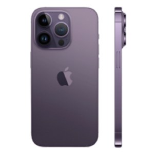
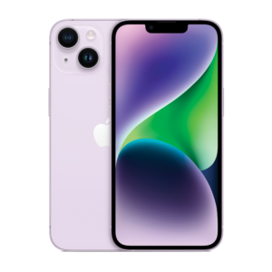
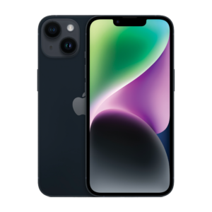
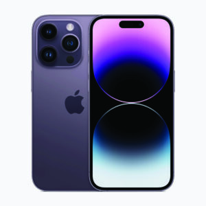
And here's outright pricing for the iPhone 14 family:
iPhone 14 Pro Max camera
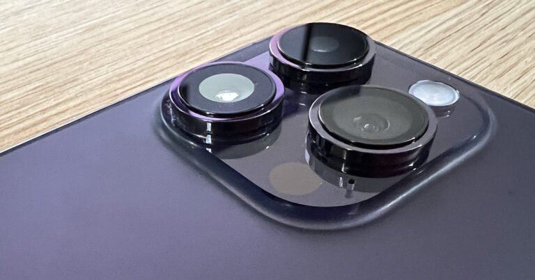
Along with the standard iPhone 14 Pro, the iPhone 14 Pro Max marks the most significant change to the iPhone's camera system in years. Apple has finally gone beyond 12MP, kitting the pair out with a 48MP primary lens.
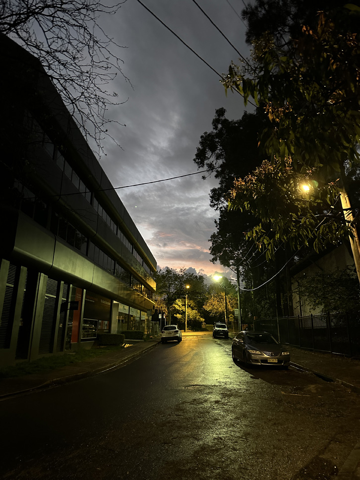
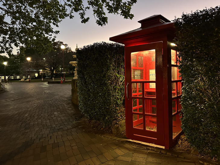
Megapixels don't indicate photo quality, but a larger photo does offer more photographic possibilities. For the most part, the iPhone 14 Pro Max still takes 12MP images. It instead uses the larger sensor to create a brighter image, improving low light performance.
This means the iPhone 14 Pro Max doesn't need to rely on night mode as much to get bright photos in dark environments, and when it does, can take them with shorter exposures, reducing the risk of motion blur. The photos aren't necessarily a massive step up over last year, but you can definitely notice the improved brightness.
The 48MP primary lens can also be used to take full-size RAW images. This is the one rare times where you'll actually take a full 48MP photo, in a completely uncompressed format. Not only does this give you more potential when editing, you've got more versatility when it comes down to cropping down a shot. The 48MP RAW photos manage to capture a stupid amount of detail. The trade-off is they tend to measure in between 60MB and 80MB per photo, so you can burn through a lot of storage quickly. You also can't take 48MP RAW photos with night mode.
The 48MP primary lens also effectively works as a 2x optical zoom lens, giving you an extra step of magnification to play with in addition to the 3x lens that was introduced last year.
The jump to 48MP has come with a few trade-offs however. You can't get as close to a subject as you could with the iPhone 13 Pro Max. Macro mode kicks in earlier, and if you turn it off, you won't be able to focus. While macro mode handles most these situations admirably, you lose the shallower depth of field you get from shooting the primary lens.
Similarly, the iPhone 14 Pro Max can be a little too aggressive with sharpening from time to time, which wasn't an issue I had last year. It's easy enough to soften an image with Apple's integrated editing tools, however.
Both the ultra-wide lens and telephoto lens also offer brighter performance over last year's models, but the improvements are most pronounced on the ultra-wide lens.
The upgraded front-facing camera is the most noticeable change, now touting autofocus and a faster aperture. There's a much clearer difference between iPhone 13 Pro Max selfies and iPhone 14 Pro Max selfies, with the new model offering more detail, more natural skin tones, and better dynamic range.
While camera quality is mostly better across the board, the real benefit of upgrading to an iPhone 14 Pro Max is the added versatility that the 2x zoom and shooting in 48MP RAW allow.
Video performance is unsurprisingly great, and still very much best in class. The new action mode for stabilising footage works well, provided you have enough light for it work. Even an overcast Sydney morning was too dim to get high quality video when I was shooting inside.








iPhone 14 Pro Max display and design
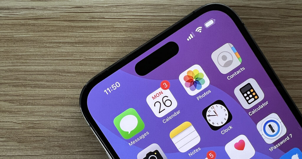
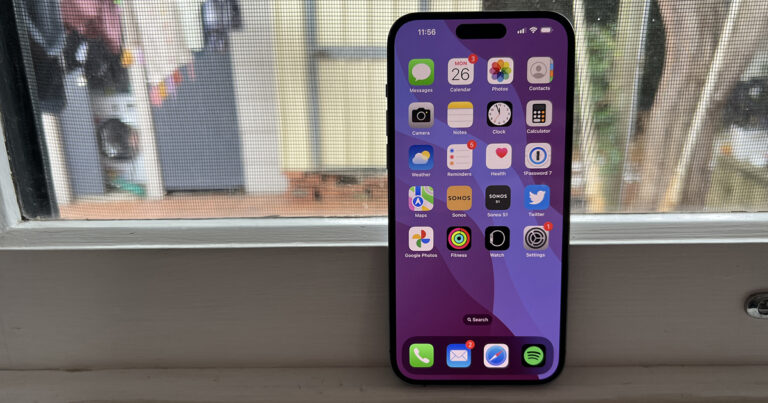
In more ways than one, the iPhone 14 Pro Max's display is easily the newest thing about Apple's latest and greatest. The most obvious change is the new dynamic island.
The dynamic island is the pill-shaped cut-out sitting at the top of the display, replacing the notch of yesteryear. In addition to housing the selfie camera and sensors needed to make Face ID work, the dynamic island is also a new part of the iPhone 14 Pro Max's user interface.
The dynamic island expands and contracts as needed to highlight extra information. On the most basic level, the dynamic island shows a small lock in it when your phone is locked. It has a charming little shake when you toggle the phone from silent to loud. It will grow into a square when an app needs Face ID authentication or you try and Apple Pay.
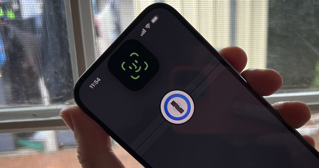
These are all cute little animations, but the real value of the dynamic island comes from its stature as a persistent user interface element. For example, if you're listening to music, the dynamic island will showcase a small version of the album art and a bouncy waveform. Long pressing the dynamic island will give you playback controls, while tapping it will open the app itself. Apps like the timer and Apple Maps also support the dynamic island, and a secondary icon can appear to the main island will pop up to help you keep track of secondary background activities. Notably, the dynamic island stops showing any background activity if you're in a game or trying to watch video.
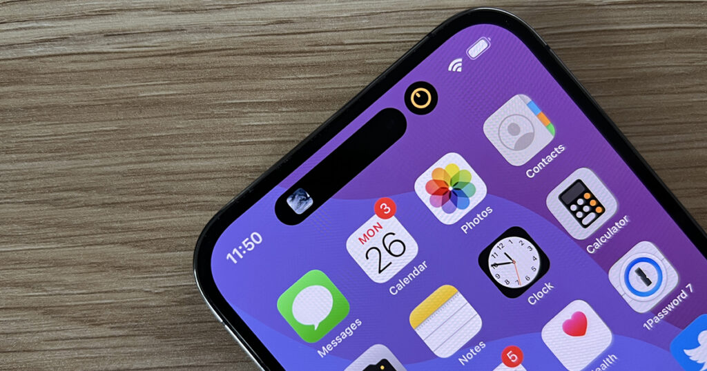
It’s a cool fusion of software and hardware, and I like how it foregrounds background tasks. It makes it easier to engage with whatever it is your iPhone is doing passively without going back to the home screen and swapping apps. The functionality is pretty limited so far, however. Live event tracking won't be available until iOS 16.1 drops sometime in the presumably near future. When it does, the dynamic island will also be able to show information like the ETA of an Uber you're waiting on, which genuinely sounds great. But as with all new features, we're going to need to wait for developers to take advantage of it to get the most.
Even if apps aren't planning to expose information in the dynamic island, some will still need to be updated for it. The dynamic island sits a bit lower than the notch on previous iPhones, which means some apps look slightly off. I haven't found an instance where this impacts usability yet, I'm a design nerd and uneven padding make Alex go something something. I'm sure the lion's share of apps will be updated in the not-to-distant future, however.
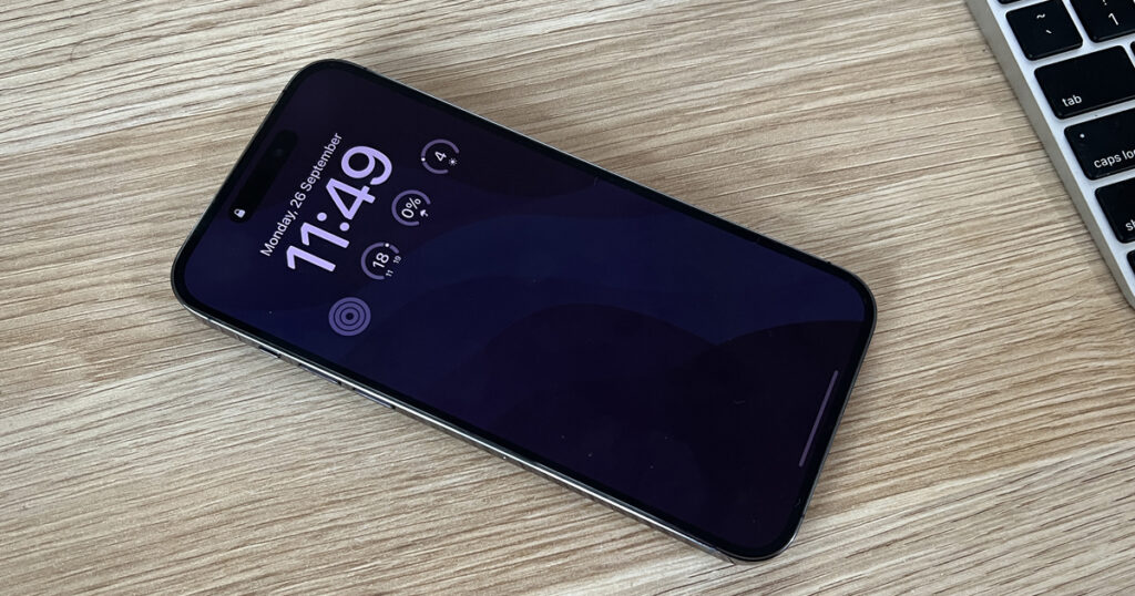
The always-on display is the iPhone 14 Pro Max's other big new feature. While Android phones have had always-on displays for almost a decade, Apple's implementation is a little different. Instead of just showing a stripped-down black-and-white interface, you get a dimmer version of your lock screen.
This has its pros and cons. You can see unread notifications without needing to wake the phone, and the splash of colour is nice. The always-on display also takes advantage of iOS 16's biggest new feature - customisable lock screens - so you can see all your widgets when the phone is inactive.
On the other hand, the always-on display can be a bit distracting. Given how much it looks like the phone is actually on, I've found it hard not to glance at it, assuming I've received a notification. And as I touch on a little later, it seems to have a slight impact on battery life. A more minimalist approach that removes your background (and as such, doesn't use those pixels, theoretically preserving battery life) could have been a happy medium ground between aesthetic and usability.
The always-on display will naturally become more useful as more apps support widgets, but I'd also love to see more space on the lock screen for them. Right now you just get one row. Lock screen widgets are also far too limited right now - you can't genuinely interact with them. Tapping them just takes you to the associated app. It's nice that I can have my reminders on my lock screen, but why can't I tick them off then and there?
From a hardware perspective, the display itself is brighter, now able to hit up to 2,000 nits outdoors. While I never had any issues with outdoor usage on last year's models, a little extra headroom can't hurt for very sunny days.
One design element that hasn't changed is the Lightning connector. The iPhone 14 Pro Max still uses Apple's proprietary jack, rather than moving to USB-C. While the change feels inevitable thanks to the European Union, don't expect to see it this time around.
iPhone 14 Pro Max battery and performance
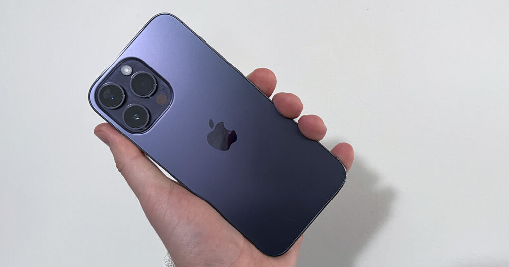
The iPhone 14 Pro Max has the best battery of any 2022 smartphone we've tested, but represents a small downgrade from last year's model. With 5G switched on, I was able to get a little over seven hours of screen time per charge. This easily represents more than a full day of moderate usage with a comfortable buffer, or close to two with lighter use. For comparison, I've found many 5G handsets can struggle to even hit four hours of screen time.
While seven hours of screen time is excellent, the iPhone 13 Pro Max was consistently able to get around eight hours of charge. If I had to guess, the always-on display is the main culprit. Even if it doesn't use very much power, keeping a colour display on is going to make a dint over a long enough period of time. And sure, you can turn it off to get a little extra charge, but then you'd miss out on one of the iPhone 14 Pro Max's most useful features.
From my testing, setting your lock screen to a pure black image seems to be a happy middle ground if you want just a little bit of screen time per charge but still want the always-on display. It also makes the phone a little less distracting when you're not actively using it.
When it comes to performance, the iPhone 14 Pro Max is impossible to fault. It has the fastest chip in any handset right now, and given neither Qualcomm, Samsung, nor Google have yet to beat last year's Apple chip, this seems unlikely to change. This also leads to the best software support of any manufacturer, and we'd expect to see the iPhone 14 Pro Max get at least six major operating system upgrades.
There are two new features worth mentioning (available across the entire iPhone 14 family), neither of which we've been able to test. The first is crash detection, because I'm not going to crash my car for a review. As with the new Apple Watch, the iPhone 14 Pro Max can call emergency services if you're in a car accident. It's a feature you hopefully never need.
The second is Emergency SOS via satellite, which won't work in Australia initially. Emergency SOS via satellite is designed to use satellite connectivity to get you in touch with emergency services when you don't have mobile coverage or WiFi. However, this feature will only be available in the US and Canada when it launches in November, but models sold locally still support it.
Given how remote parts of Australia are, this Emergency SOS via satellite could be a game changer for those who live in areas where they don't have reliable mobile coverage. Once again, it's functionality you'll hopefully never need, but that could potentially be a lifesaver in events like the 2020 bushfires or any of the recent floods.
Is the iPhone 14 Pro Max worth buying?
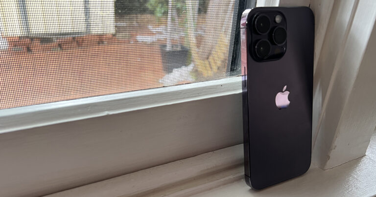
The iPhone 14 Pro Max sits on the bleeding edge. It's Apple's latest and greatest, but the new features make it feel less polished than its predecessors. It goes without saying that these key improvements like the 48MP camera, always-on display, and dynamic island will all be better next year.
And yes, that's the case every year, but the iPhone 14 Pro Max feels like a transitionary product that sets up the next few years of iPhone. When you take big swings, it's not surprising when there are a few teething issues. I'm sure software updates will help with some for those that get in early.
Growing pains aside, the iPhone 14 Pro Max is an excellent device for those that want a great camera and long-lasting battery. It's just a shame the steps forward also have one or two steps back.
Disclosure: This author owns shares in Apple
How does this compare to the latest iPhone?
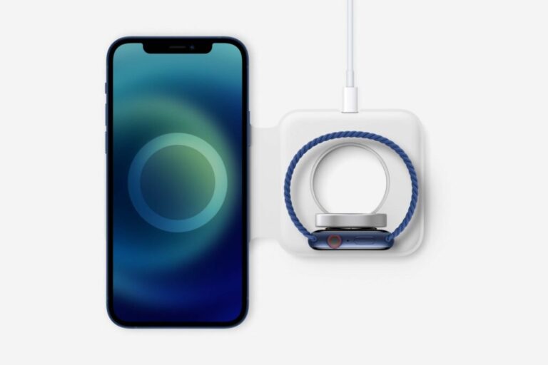
Need a charger to go with that iPhone?
Change up your charging setup with our guide to the best (and fastest) iPhone chargers you can find in Australia.
Related Articles


