Apple has been going through a phase. For years it abandoned the bright tech that captured our attention, for a sea of black and white. During these years it was clear Apple was taking itself more seriously. It was all about business, and getting those phones and Macs into the hands of serious business people. Recently this monochromatic hue has been lifting. We’re seeing more colour in hardware like displays and phones, but perhaps more significantly it is coming through in operating system design - beginning with the Dynamic Island.
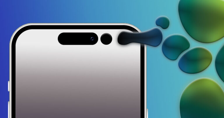
Physically the Dynamic Island holds the selfie camera, but where it differs from other camera cut-outs is within the UI. The persistent pill acts as a widget allowing users to interact with apps directly from the home screen. Uber will show the ETA of your driver in the pill, Spotify shows what is currently playing, a timer counts down. It's practical, but more interestingly the animation style Apple adopted for Dynamic Island is playful. The pill doesn’t just sit still in space, it is like a lava lamp - bubbling, expanding, shrinking, bouncing, splitting and coming back together again. Apple chose to put the ‘fun’ in functionality with the Dynamic Island.
Getting rid of the notch seemed like a bold move away from Apple’s branding. The notch was distinctive enough that you could always tell when you were looking at an iPhone - even if it was in a black and white vector format. Nixing it ran the risk of making iPhones look like every other phone - a rectangle with a hole punch cut out. Unique though it was, the notch was also lifeless. It was criticised for its impracticality, and waste of screen real estate. In many ways, the notch encapsulates Apple’s monochromatic chapter while The Dynamic Island ricochets hard in the opposite direction.
Rather than sitting stagnant, the Dynamic Island takes up space and attention. It wants you to perceive it. To use it. To be influenced by it. Apple makes so many quiet, imperceptible changes to its technology, that this flashy UI change should be taken for what it is - a sign of a new direction. One Apple has already turned towards.
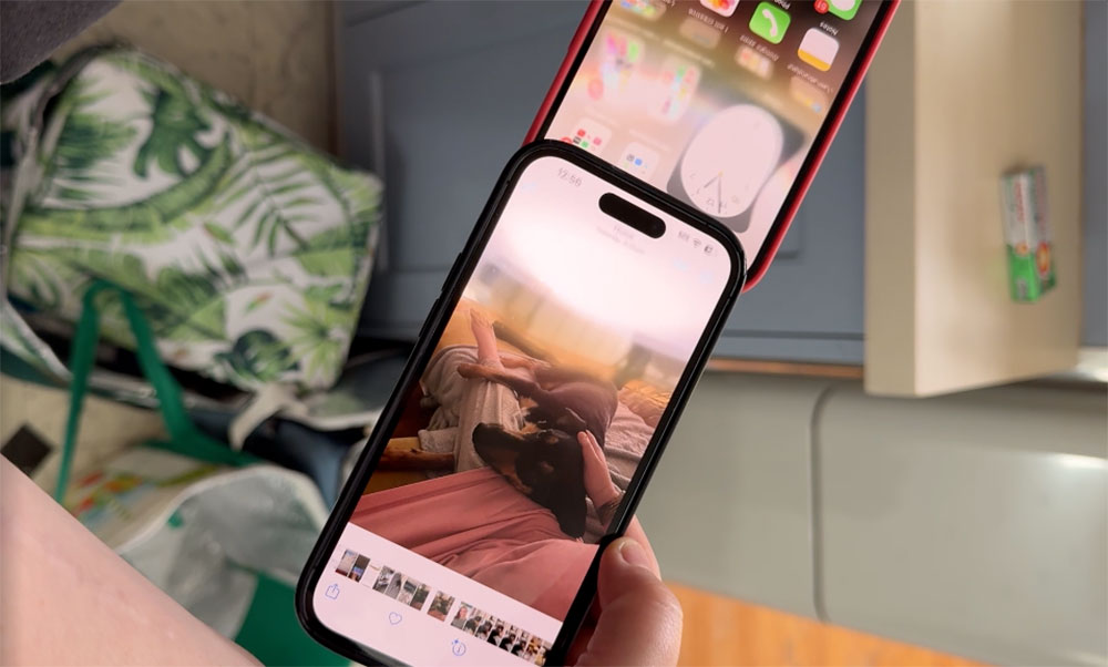
iOS 17, and Watch OS 10 have brought a gleefully chaotic energy with their new animations. Tap to Share AirDrop’s animation demonstrates this best - when you tap the two phones together, both screens warp and pull from the charging port up towards each other. A beam of light makes its way up the phones, sparkling, until the two meet at the top of the phones and they both bounce back to normal. A pre-Dynamic Island iPhone would never add that kind of flare and flavour to a file transfer. It would feel out of place, but coupled with the springiness of the Island, it doesn't.


